When Georgiou reached out, they had a problem most businesses can relate to. A tender deadline that wasn't moving, and a piece of the submission that wasn't finished yet.
The WA Government required an alliance logo, as part of a major EOI submission, and the timeline was tight. We were asked for a draft within days, with a final design ready before the tender went in.
The challenge
Create a professional brand identity that would strengthen a high-value government tender while working to a tight deadline and an evolving brief.
The project required us to:
Deliver initial brand identity design concepts within days
Work from a project overview and a handful of key themes, as the alliance name itself was still being finalised as we worked
Create something that reflected the actual project: an entertainment precinct on the river, designed as a community space
Keep the identity flexible enough to work across a formal tender document as well as future public facing use.
Our approach
When you're designing for a tender submission, every decision needs to support the bigger picture.
So, we built the identity around the two ideas Georgiou wanted front and centre of the project: urban renewal and community. Whatever we designed needed to say "this is a place people will actually use", and not just look good on a cover page.
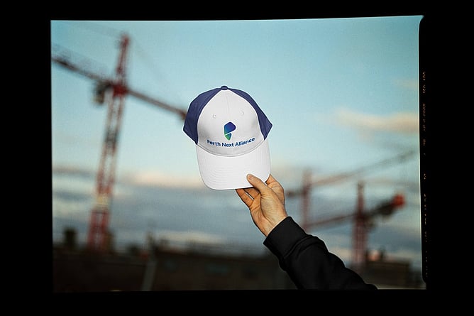
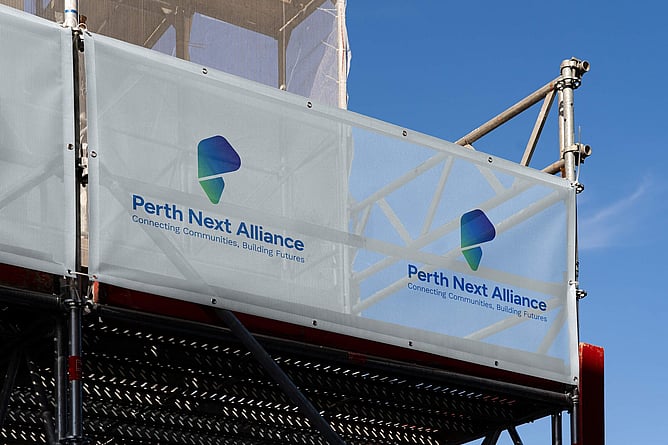
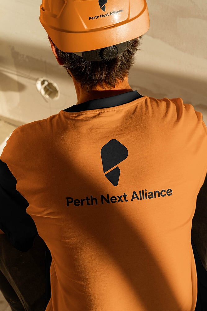
To create a personalised alliance logo, we focused on developing a visual identity that reflected the purpose of the project and the organisations behind it. The icon is a stylised "P," formed by two flowing shapes that move forward together. It reflects unity and momentum, and the open centre gives it a sense of clarity rather than a closed, corporate mark.
We proposed a blue and green gradient to tie the brand back to the river setting, and paired it with typography that could hold its own in a formal tender document while still feeling approachable for a community facing space.
The name itself, Perth Next Alliance, was confirmed partway through the process. We built the system to be flexible enough that it could flex around late changes like this without blowing out the timeline, or delaying delivery of the project.
What we delivered
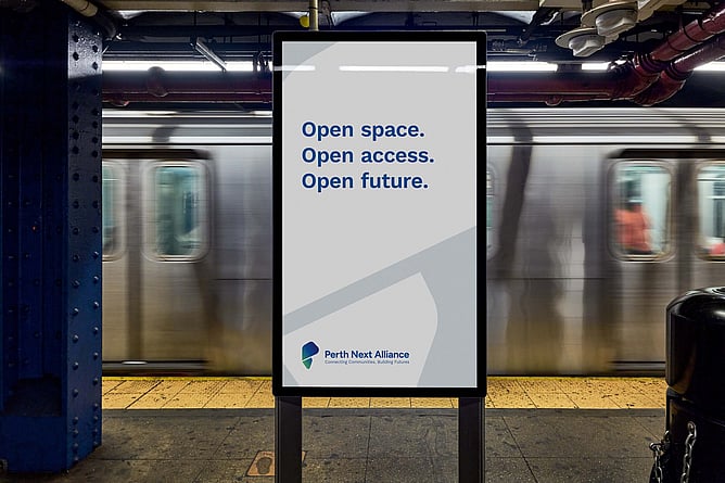
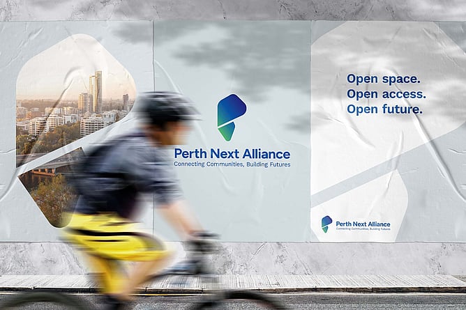
A complete brand identity, logo, colour palette, typography and application guidelines, delivered within the tender deadline.
Georgiou's team had what they needed to submit on time, with a brand that reflected the actual intent of the project rather than a generic placeholder mark.
Why brand identity design matters for tenders
A logo dropped onto a cover page at the last minute looks exactly like that. Evaluators notice when a submission feels rushed or generic. Proper brand identity design for tenders means the visual identity actually reflects the project, which signals to the panel that the team behind it has done the work.
Great design won't win a tender on its own. But it helps ensure your capability isn't overshadowed by the presentation.
Support when deadlines matter
Construction and infrastructure tenders rarely run to perfect timelines. Briefs evolve, stakeholders change their minds, and new requirements appear late in the process.
We work alongside marketing managers, bid teams, and project leaders to deliver professional design support when it matters most, helping submissions look organised, consistent and ready to go without creating more work for your team.
Need brand identity design for your next tender? Get in touch and let's work out what you need.