A tequila brand targeting 20-35-year-olds who enjoys a good time!
Drinking alcohol has long been associated with social events, hanging out with friends and parties; of course. But did you know that the logo design and packaging design chosen by an alcohol brand can determine who chooses to drink it?
This wacky and fun tequila brand, No Me Acuerdo, or ‘I don’t remember’ was all about creating good times and helping people form lifelong memories with their friends; even those memories that are somewhat foggy. Just one shot or mixed drink with this powerful tequila can transform a mellow party into a good time. But when we first laid our eyes on the brand, it seemed to be missing something. The branding and ideas were great, but the visuals targeted the wrong customers.
So, we quickly partnered with our design buddy, Tessa Haywood, to change this branding package for the better - Check out her amazing work @coffey.creativestudio.
Targeting males and females from 20-35 years old, when creating the logo and package design for No Me Acuerdo, we knew we needed something that was both fun and sophisticated. After all, many of these target drinkers had tried tequila before, but not the authentic kind No Me Acuerdo produces. We needed a branding design that showed how they were different while appealing to their traditional Mexican heritage.
Rather than sticking with the overused red tones often associated with Americanised Mexican culture, we took a different route.
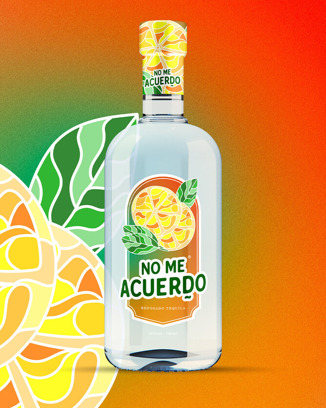
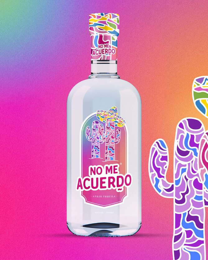
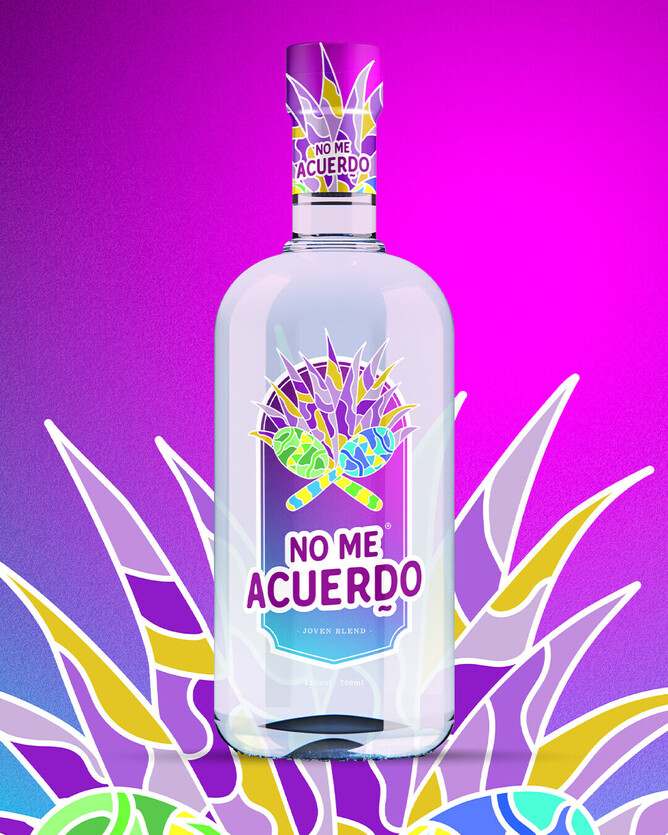
When designing this package, we focused heavily on Mexican celebrations, particularly Cinco De Mayo and the Day of the Dead. This allowed us to really navigate traditional imagery without needing excessive sombreros and tacos.
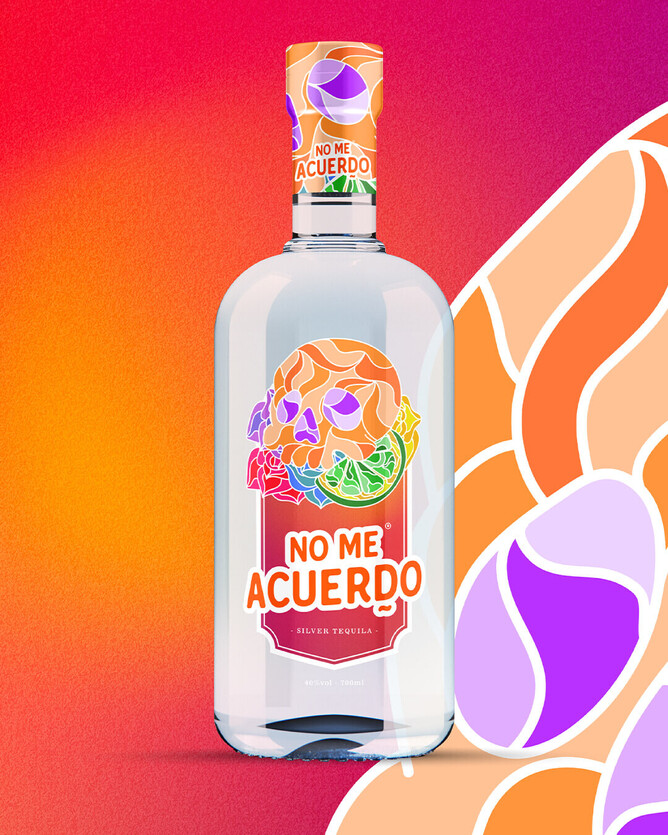
Through careful research, we worked with Tessa to take some of the most recognised Mexican symbols and incorporate them into detailed product packaging designs. We merged our graphic design skills to create a colourful, powerful and eye-catching design that could stand out on the shelves.
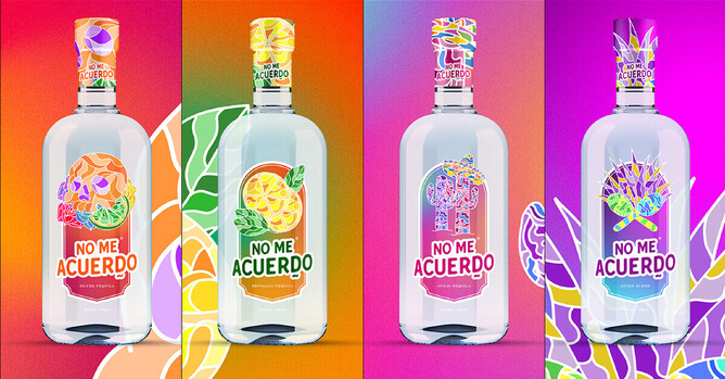
We created four tequila labels in total. The elements we chose included traditional Mexican Skulls, Cacti, Lemon and Lime, and Maracas. We used colour-blocking techniques in a mosaic-style design to guarantee that the product would make an impact, especially when on the shelves next to other tequila products.
This colour blocking created a sense of character but still allowed the product to be positioned on the shelves as affordable. This is an essential factor for most 20-35-year-olds when purchasing alcohol, especially from a brand they haven’t tried in the past. As the colours were all those which are usually associated with Mexican events, this graphic design also looked much more authentic on the shelves. It instantly gave off the energy that one sip could transport someone to Mexico.
If you love this design and want to get started on your own branding journey, we'd be delighted to support you. Find out more about our Australian-made branding packages here. Or, fill in the form to get started today.