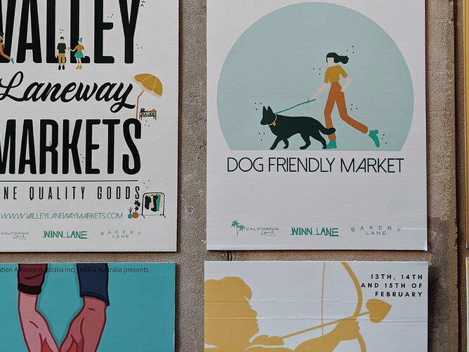
Remove common design mistakes and skyrocket your next advertising campaign with this simple guide.
We all want to run successful advertising campaigns. After all, it’s no secret that they cost a small fortune, right? But when it buckles down to it, unless you have a background in advertising, marketing or graphic design, it can be hard to identify where your campaigns are leading you astray.
Though it may seem like your audience isn’t interested in your product, many other factors may influence a lack of purchases. In fact, in many cases, business owners have the right product but are just struggling to communicate this to their clients.
Before creating your next advertising campaign, reflect on these common mistakes so you can build highly engaging content.
👎 Too many messages
When you put pen to paper, every product provides multiple uses customers can take advantage of. So, what is the main benefit you have sought to accomplish?
When advertising, it’s all well and good that you want to show your customers how much you can do. However, it is much more important that you stick with a simple message that showcases the value of your product or service.
Remember, you only have limited space. It’s better to make ONE element shine rather than confuse your audience with too many ideas or contradictory messaging.
👎 Too many fonts
We will be the first to admit that we are obsessed with different fonts. It’s so magical how changing something from modern to cursive can revolutionise the tone of your advertisement.
This is also exactly why using multiple fonts is a huge no-no in the design world. Not only do several fonts make your content hard to read, but they can also send mixed messages to your target market. They can turn what would have been your customers' ideal product into one they choose to avoid.
When choosing fonts, stick to two at most. Ideally, it’s better to play with the weights and typeface rather than using different font types.
👎 Using words instead of visuals
With the rise of the digital age and social media has come the era of lazy reading. Think about how you’re reading this blog. Rather than savouring every word, you are likely skimming through it to find the information you need.
In the same way, customers will only ever read text that appeals to their interests or needs. Too much text and they are likely to back away from your advertisement altogether.
When you can’t tell your customers what you want them to know, show them. Visuals are much more identifiable and relatable. They will usually communicate your message better than words.
👎 Not enough white space
Your eyes need to have the chance to rest. If every corner of your advertisement is full, it is likely to cause confusion. Leaving white space will give your audience time to process your message.
👎 Not choosing the right colours
Did you know that colour can directly play into your emotions? For example, red is known to trigger urgency and action. Whereas, a pastel blue can stimulate calm. When choosing your colour palette, you must use hues that will set the tone for how you want your customers to feel.
As another example, someone running a Mexican restaurant would likely use red to show energy, fire and spice. However, a sushi train would better use green or blue to represent a relaxed environment.
👎 Lack of contrast
Every graphic design needs something that will make it POP. Though you may focus on a specific colour theme, choosing the right colour palette within this theme will help your design stand out amongst advertising clutter.
👎 No Hierarchy
Within one message, there are many micro messages. For example, you may have the best apple pie in Queensland, and you offer FREE taste testing every Saturday. The most important part of this message is the clause about the free tastings. Placing this first on your visual or in your copy can highlight its importance.
👎 Overuse stock images
We all love how stock images can pull us out of a tight situation. Though where some pictures are great, most can make your ad look unprofessional. Spending the extra money on a product shoot will enhance your brand’s personality, unique quirks and points of differentiation. It provides a taste of your business and is the ultimate way to attract customers to your brand.
We hope this handy guide pointed out what you should look to amend in your next advertising campaign. Though it can be difficult, with enough practice, you will be designing kickass campaigns in no time.
If you prefer to leave the design work in the hands of a professional, we are always here to help. Contact us today to get started on designing some high-value advertising campaigns.


