If there is one thing that stumps business owners more than anything in their branding phase, it’s trying to find a logo that captures their essence and showcases what their brand will deliver.
Years ago, people would have told you that it’s all in your logo’s ability to capture an audience’s attention. And so, many business owners flocked to using the colour red and heavy contrast in their designs. But, amongst this sea of red, it became clearer that the most effective logos were those where the design captured what the business was all about.
But how does this work? Well, it’s all deeply rooted in colour psychology.
What is colour psychology?
After years and years of marketing materials have hit the streets, it’s only natural that our brains subconsciously associate certain colours with specific moods and feelings. This subconscious reaction can invoke a response that will also impact how we act around certain imagery. As a result, it’s so important for brands and business owners to do their research when selecting a colour for their logo. Doing this correctly will ensure brands generate the desired response from their target customers.
What does each colour mean?
This brings us to how you can communicate with your customers using colour. Each colour has a generic feeling or energy associated with it, which has been pre-determined through years of marketing. You can use these in-built presumptions to frame your branding.
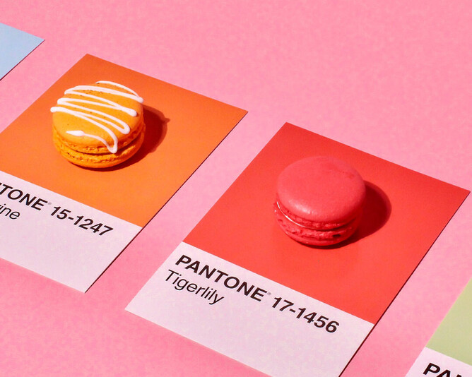
Examples of colours and their psychologies include:
🍓 Red
It’s no secret that the colour red is eye-catching. Most commonly associated with power, excitement and romance, red is a powerful colour as it can reduce the brain’s analytical thinking by stimulating excitement. It is, therefore, great for businesses and restaurants, particularly fast-food chains, that want to generate quick, short-term sales.
🍊 Orange
Orange is potentially the most controversial colour for logo design. On one hand, it is an enthusiastic colour that breathes energy into any brand. Though, when used inappropriately, it can be harsh on the eyes and turn people away. It’s important to balance orange with a neutral colour so you can communicate your brand’s love for fun without losing potential customers.
🍌 Yellow/Gold
The colours of wealth and riches, yellow and gold can quickly bring happiness and energy to customers. It is great at promoting optimism and positive connotations toward your brand, even before potential customers try your product. Using lighter shades, like the yellow of the Mcdonald’s logo, can create feelings of optimism and energy. While the darker shades, like that of the Lindt logo, are more commonly associated with exclusive luxuries.
🥑 Green
Green is the colour of health and nature. It has widely been associated with brands that want to help people or the environment grow and prosper. Green is also the easiest shade on the human eyes. It is often used for promoting relaxation. An example of the colour green in action is through the brand, Starbucks, which provides a relaxing environment where business people can conduct meetings, enjoy their favourite brew and prepare for the work day.
🐟 Blue
Known as a soothing colour, many companies and corporations quickly flock to the colour blue to communicate they are trusting. It is one of the most widely used colours for service-based businesses which rely heavily on building a sense of security between their customers to form long-term working relationships.
🍆 Purple
Purple is often associated with luxury, royalty and power. It can quickly trigger associations with indulgence and help any brand communicate that they produce the most extravagant product. Take Hallmark, for example. Their purple and white logo immediately shows that they provide luxurious, high-quality gifting cards and paper products that you can’t access from any decorative paper supplier.
🍴 Silver/Grey
When used effectively, silver and grey tones can give off an energy of wealth, maturity and timelessness. It is a colour of power that can showcase your brand’s knowledge and experience. For example, Swarovski has a long history in glass and crystal blowing. They use their grey logo to show that they have an unmatched skill set that can’t be beaten.
💖 Pink
Some studies show that the colour pink is one of calmness, tranquillity and hope. The colour pink is associated with fairy tales, childhood and young girls. It carries a playful tone and pairs well with a brand that is always ready to create fun for its customers. An example of this is how Barbie aims to inspire young girls all around the world.
☕️ Black
Holding authority, black is commonly used to show sophistication, class and knowledge. When used in branding, it can demonstrate that your brand is a knowledgeable figurehead. Black ink on white paper also has incredible contrast, making it stand out.
So which colour should you choose?
When it buckles down to it, there is no one solution for brands operating in a particular industry or niche. For example, there could be two restaurants both serving bar food. One is heavily focused on healthy options and changing the bar experience, and so would likely benefit from a green logo to promote this health. Whereas, the other may focus on creating affordable meals for families in a fun environment. This second brand would likely benefit from carefully using shades of orange.
If you ask us, there is no colour you must or mustn’t use when designing a logo. Rather, you should consider your brand personality, who you want to be as a business owner and what you want your customers’ first impressions of your business to be.
We're here to help
If you’re struggling, try to think about who your brand is compared to your competitors. The key differences you come up with will ultimately drive the direction of your logo colour design more than anything else. Need a hand? If you need help during the logo design phase, we are always here. Unlike big design corporations, when you work with us what you see is what you get. We always prioritise the one-on-one personalised experience and want to make everything a breeze for you.
Fill out the enquiry form or let’s have a chat to discover the best colour for your business.

